
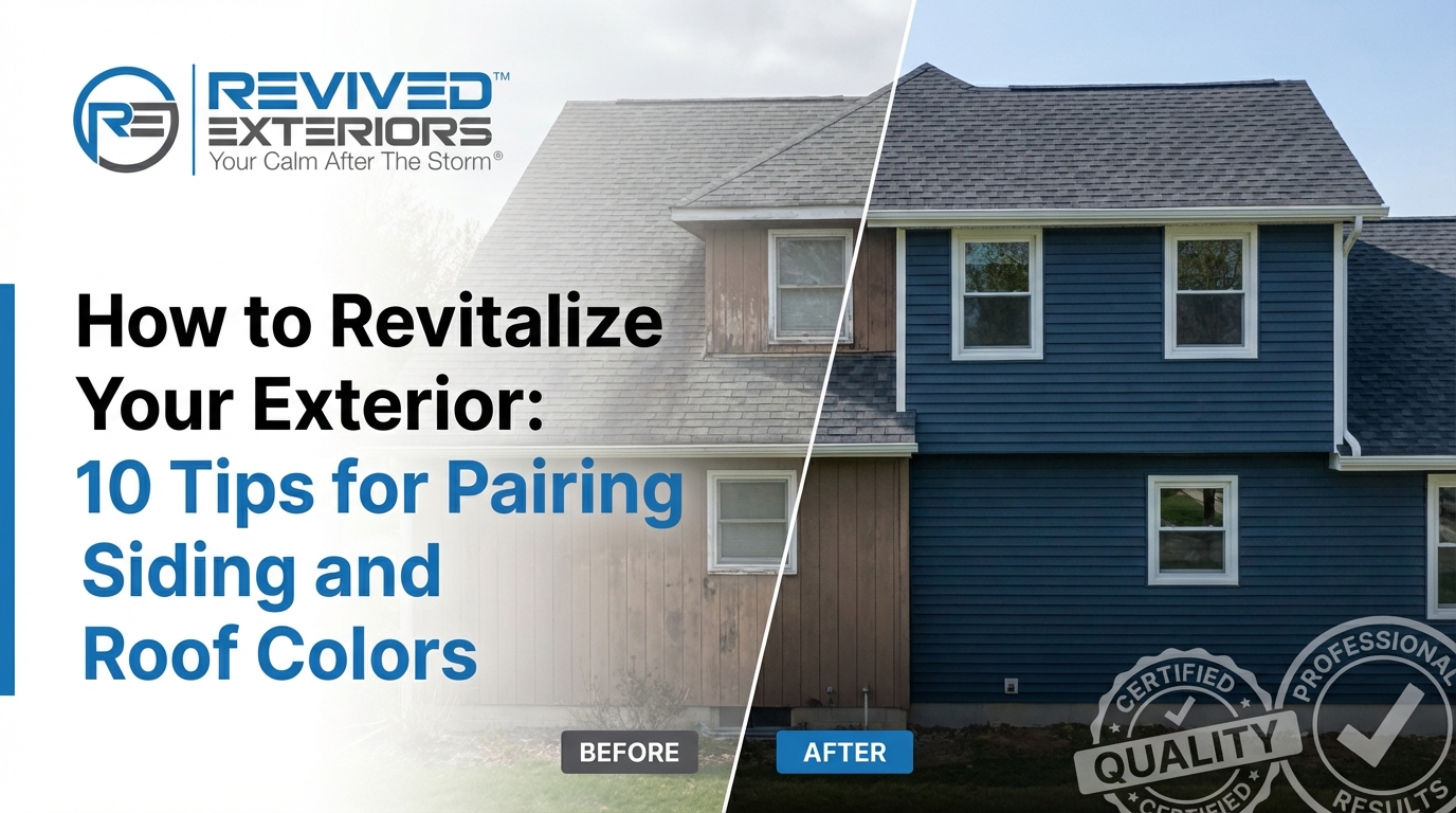
Revitalize Your Exterior: The Ultimate Guide to Pairing Siding and Roof Colors
Your home is more than just a shelter; it is a significant financial asset and a reflection of your personal style. When it comes to home improvement, few projects offer as much transformative power as updating your exterior. However, the process of pairing siding and roof colors often feels overwhelming for homeowners. Choosing the wrong combination can lead to a visual clash that diminishes curb appeal, while the right selection can elevate your property’s aesthetic and significantly increase its market value. This guide provides a comprehensive framework to help you navigate these choices with the confidence of a professional designer.
Beyond simple aesthetics, the colors you choose have a profound psychological impact. A well-coordinated exterior suggests a home that is well-maintained and cared for, subtly signaling reliability to visitors and potential buyers alike. In the real estate world, first impressions are formed within seconds of pulling up to the curb. By mastering the art of color coordination, you aren’t just “painting a house”; you are performing a strategic upgrade that balances energy efficiency, material longevity, and neighborhood harmony.
At Revived Exteriors, we understand that Chicago-area homeowners face unique challenges, from harsh winters to humid summers. These environmental factors play a massive role in how colors age and how materials perform. In this definitive resource, we will break down the science and art behind pairing siding and roof colors, ensuring your home remains the standout of the block for decades to come. Whether you are considering James Hardie fiber cement siding or modern asphalt shingles, the following principles will guide your journey.
How do you pair siding and roof colors effectively?
The most effective way to pair siding and roof colors is to identify the underlying warm or cool tones in your materials and create a balanced contrast. Generally, you should pair a dark roof with lighter siding for a grounded look, or use low-contrast neutral tones for a modern, expansive feel. Always coordinate with permanent features like brick or stone to ensure a cohesive exterior.
1. The Fundamentals of Color Theory: Warm vs. Cool Undertones
Understanding color theory is the first step in avoiding a costly design mistake. Every color has an “undertone”—a subtle hue that sits beneath the primary color. When pairing siding and roof colors, the most common pitfall is mixing warm undertones with cool ones. For example, a roof with warm brown granules will likely clash with siding that has cool, blue-gray undertones. Identifying these tones early allows you to create a harmonious palette that feels intentional rather than accidental.
Identifying Your Home’s Base Temperature
Warm colors include shades of red, orange, yellow, and brown. These colors tend to feel inviting and traditional. Cool colors, on the other hand, include blues, greens, and true grays, which offer a more modern and serene vibe. When selecting your roof, look closely at the shingle samples in natural sunlight. You might notice flecks of green (cool) or orange (warm) that aren’t visible indoors. These flecks should dictate the direction of your siding choice to ensure the two components “talk” to each other effectively.
The 60-30-10 Rule for Exteriors
A classic design principle used by professionals is the 60-30-10 rule. In an exterior context, approximately 60% of your home’s visual surface is the siding, 30% is the roof, and the remaining 10% consists of accents like the front door, shutters, and trim. By following this ratio, you prevent the colors from competing for attention. If you choose a bold, dark siding (the 60%), balance it with a neutral roof (the 30%) and a vibrant accent color on the door (the 10%) to create a focal point that draws the eye.
2. Architectural Integrity: Matching Palettes to Your Home’s Style
Architectural style provides a historical and structural blueprint for color selection. A sleek, ultra-modern home demands a different palette than a Victorian or a classic Cape Cod. Ignoring the “spirit” of your home’s architecture can lead to a visual disconnect that feels jarring to passersby. When pairing siding and roof colors, look to the design era of your home for inspiration while adding modern touches to keep it fresh and updated.
The Modern Farmhouse Aesthetic
The Modern Farmhouse remains one of the most popular trends in the Midwest. This style typically utilizes high contrast: crisp white vertical or horizontal siding paired with a stark black or charcoal gray roof. The simplicity of this palette emphasizes the clean lines of the home. To add depth, many homeowners are now incorporating “smart” accents, such as natural wood lintels or black metal roofing on porches, to provide texture alongside the primary color scheme.
Traditional Craftsman and Colonial Styles
Craftsman homes are rooted in nature, often favoring earth tones like olive green, deep russet, and warm ochre. Pairing these with a weathered wood or brown shingle roof creates a grounded, organic feel. Colonial homes, conversely, often lean toward a more formal appearance. Light grays, soft blues, or creamy whites paired with a dark slate-gray roof provide a timeless elegance that has remained popular for centuries.
3. Working with the ‘Unchangeables’: Coordinating with Brick, Stone, and Landscape
While you can easily change your siding or roof during a renovation, features like brick foundations, stone chimneys, and your existing landscape are often permanent. These “unchangeables” should serve as your primary color anchors. If your home has a red brick facade, you must choose a roof and siding that complements the multi-tonal nature of the brick. Failing to account for these elements can make your new siding look like an after-thought rather than a cohesive part of the structure.
Extracting Colors from Natural Stone
If your home features stone veneer, look at the individual stones to find secondary colors. Most stone contains a variety of grays, tans, and even purples. By selecting a siding color that matches one of the lighter shades in the stone and a roof color that matches one of the darker shades, you create a built-in color bridge. This technique ensures that the transitions between different materials feel seamless and professional.
Considering Your Environment and Landscape
Your surroundings also dictate how your home is perceived. A home nestled in a heavily wooded lot in the Illinois suburbs might get lost if painted in dark forest greens. In this case, a lighter tan or gray siding can help the home pop against the greenery. Conversely, a home on a bright, open coastal-style lot can handle deeper, bolder blues and grays that would look too somber in a shaded environment. Always consider how the changing seasons and natural light will interact with your chosen palette.
4. The Science of Contrast: When to Go Bold vs. When to Stay Subtle
Contrast is the most powerful tool in a designer’s arsenal for manipulating the perception of a home’s size and shape. High contrast (dark vs. light) creates drama and highlights architectural details, while low contrast (monochromatic) provides a sense of calm and can make a smaller home appear larger. When pairing siding and roof colors, think about the “visual weight” you want to project. A dark roof on a light-colored house draws the eye downward, making the home feel solid and permanent.
Using Contrast to Alter Size Perception
If you have a tall, narrow house, using a darker roof can help “squat” the proportions, making it feel more balanced. For a small ranch-style home, choosing a roof and siding in similar, light-neutral tones can eliminate the visual break at the roofline, tricking the eye into seeing a larger overall structure. This is a subtle trick that many professional roofing and siding contractors use to maximize a property’s visual potential.
The Power of Accent Colors
Contrast isn’t just about the roof and siding. Trim and shutters provide the “outline” for your home. White trim is the most common choice because it offers a crisp border that works with almost any color. However, dark trim—such as charcoal or black—is a rising trend that offers a sophisticated, “framed” look. This is particularly effective when used with mid-tone siding, as it creates a layered effect that adds immense depth to the exterior.
5. Climate-First Choices: Balancing Energy Efficiency with Aesthetic Goals
In regions like Chicago, the color of your exterior isn’t just a design choice—it’s an engineering decision. The Solar Reflectance Index (SRI) measures how well a surface reflects solar heat. Dark colors absorb more heat, which can be beneficial during frigid Illinois winters as it helps melt snow and ice. However, those same dark colors can cause your attic temperatures to skyrocket in the summer, increasing your cooling costs and putting extra strain on your HVAC system.
Heat Absorption and Roof Longevity
Extremely dark roofs can reach temperatures 50 degrees higher than lighter roofs on the same day. This heat doesn’t just impact your energy bill; it can actually accelerate the aging process of the shingles, causing them to become brittle and lose granules faster. If you are set on a dark aesthetic, consider “cool-roof” technology shingles that use specialized granules to reflect infrared radiation while maintaining a dark appearance. This allows you to have the look you want without the thermal penalty.
Siding and Thermal Expansion
Siding materials, particularly vinyl, are prone to expansion and contraction based on temperature. Dark siding colors absorb more UV rays and heat, which can lead to warping or “oil canning” if not installed with proper clearances. This is why premium products like James Hardie Fiber Cement are often preferred for dark palettes; their dimensional stability ensures the material stays flat and beautiful regardless of heat absorption.
6. Material Matters: How Texture and Siding Type Change Color Perception
The same color will look entirely different when applied to different materials. Texture creates shadows, and shadows change our perception of depth and hue. When pairing siding and roof colors, you must account for how light hits the surfaces. A smooth vinyl siding will reflect light more uniformly, often appearing brighter than a textured fiber cement siding in the exact same shade. This nuance is why viewing physical samples on-site is non-negotiable.
Mixing Textures for Visual Interest
A modern design trend involves mixing siding styles, such as combining horizontal lap siding with vertical board and batten or shake accents. This multi-texture approach allows you to use a single color while still creating visual separation. For instance, using the same dark gray on both lap and board and batten siding creates a sophisticated, tonal look where the shadows in the vertical grooves provide the necessary contrast. This is an excellent way to modernize a traditional home without introducing too many different colors.
The Role of Shingle Texture
Architectural shingles (also known as dimensional shingles) offer more texture than traditional 3-tab shingles. This added dimension creates a “variegated” look on the roof, meaning the roof isn’t just one flat color but a mix of complementary shades. When pairing these with siding, ensure the siding isn’t too “busy.” If your roof has a lot of texture and color variation, a simpler, more uniform siding color will keep the house from looking cluttered or visually exhausting.
7. Visualizing the Future: Beyond Swatches to Digital Modeling
Relying on a 2-inch plastic swatch to choose the color for your entire home is a recipe for “buyer’s remorse.” Colors look significantly lighter when applied to a large surface area outdoors than they do on a small sample inside a showroom. To truly understand how pairing siding and roof colors will work, you need to leverage modern technology and real-world testing. Digital visualizers have revolutionized the way homeowners plan their exteriors, allowing you to upload a photo of your actual home and “try on” different combinations.
The Importance of Real-World Sample Testing
Once you’ve narrowed your choices down using a digital tool, order large physical samples. Place them against your home’s exterior and observe them at different times of the day: early morning, high noon, and dusk. A gray that looks perfect in the morning might turn surprisingly purple under the setting sun. Also, consider placing the siding sample next to your existing trim and roof (if you aren’t replacing it) to ensure they harmonize in all lighting conditions.
Smart Technology and Solar Integration
For forward-thinking homeowners, the rise of solar shingles and solar-integrated roofing adds a new layer of complexity. These systems often come in a limited palette, usually deep blacks or very dark grays. If you are planning for solar, your siding choice should be made with these fixed roof colors in mind. Choosing a neutral or slightly warmer siding can help soften the industrial look of solar panels, making the technology feel like an integrated design feature rather than an eyesore.
8. The ‘Neighborhood Factor’: Standing Out Without Clashing
No home exists in a vacuum. Your house is part of a streetscape, and while you want it to reflect your personality, you also want to maintain the collective value of the neighborhood. This is particularly important if you live in a community with a Homeowners Association (HOA), which may have strict regulations on acceptable color palettes. Even without an HOA, being the “neon house” on a block of neutrals can negatively impact your resale value and relationship with neighbors.
Navigating HOA and Community Guidelines
Before finalizing your pairing, always check your local bylaws. Many HOAs require pre-approval for color changes and may have a pre-approved list of color combinations. If you want something outside of the norm, focus on “neighborly harmony.” Look at the two houses on either side of yours and the three across the street. Your goal should be to choose a palette that complements those homes without duplicating them. If both neighbors have beige houses, perhaps a soft sage green or a light blue would provide a nice variety without clashing.
Regional Trends in Illinois
In the Chicago suburbs, we see a move away from the “beige-on-beige” look of the early 2000s toward more saturated, sophisticated tones. Deep navy, forest green, and even dark charcoal are becoming staples. These colors work exceptionally well with the dramatic seasonal changes in the Midwest, looking just as beautiful against a backdrop of autumn leaves as they do against a fresh winter snow. By following these regional trends, you ensure your home looks modern and relevant for the local market.
9. Long-Term Maintenance: Choosing Colors That Age Gracefully
A great color pairing should look as good in year 15 as it did on day one. However, different pigments age at different rates. UV exposure is the primary enemy of exterior color. High-pigment colors, such as vibrant reds, deep blues, and certain yellows, are more prone to fading than earth tones or neutrals. When choosing your palette, consider the maintenance commitment required to keep those colors looking sharp. At Revived Exteriors, we often recommend products with baked-on finishes to mitigate these issues.
Fading and UV Resistance
Specific colors are scientifically more likely to fade. For example, red pigment molecules are smaller and more easily broken down by sunlight. If you choose a bold red siding, you may find the south-facing side of your home looking significantly duller than the north-facing side within a decade. Neutrals like tans, grays, and whites are far more resilient. If you want a bold color, invest in high-quality materials like James Hardie’s ColorPlus® Technology, which is specifically designed to resist UV fading better than field-applied paint.
Hiding Dirt and Wear
Practicality is a part of beauty. Very light siding (like pure white) will show every bit of splash-back from rain and dirt from the garden, requiring more frequent power washing. Very dark siding can show salt spray or pollen more prominently. Mid-tone neutrals are the most forgiving, masking the inevitable environmental grime that accumulates between cleanings. Similarly, a roof with a blend of colors (rather than a solid flat black) will hide minor shingle wear and airborne debris much better over time.
10. Conclusion: Creating a Timeless Exterior That Increases Home Value
Successfully pairing siding and roof colors is an investment that pays dividends in both personal enjoyment and financial return. According to the National Association of Realtors, exterior upgrades consistently rank among the highest ROI projects for homeowners. By balancing color theory, architectural history, and climate considerations, you create a home that is not just a house, but a masterpiece of design. Remember, the goal is not to follow every fleeting trend, but to choose a palette that feels authentic to your home’s character and your personal style.
As you move forward with your exterior renovation, don’t feel you have to do it alone. Expert guidance can help you avoid common pitfalls and ensure that your material choices—from seamless gutters to attic ventilation—all work together to protect your home. A professional assessment can also identify if your color choices might have insurance implications; for example, certain high-durability roofing materials in specific colors may qualify for premium discounts due to their hail resistance and thermal properties.
At Revived Exteriors, we take pride in being “Your Calm After The Storm.” We combine 25 years of family-owned experience with the highest quality products to revitalize homes across the Chicago area. From the first color consultation to the final shingle placement, our team is dedicated to providing a stress-free experience that leaves your home looking beautiful and standing strong. Let us help you turn your vision into a reality that enhances your curb appeal and provides long-term peace of mind.
Ready to Revitalize Your Home?
Superior craftsmanship, quality products, and a stress-free customer experience delivered at fair market prices by a family-owned team with over 25 years of experience.

 Revived Exteriors


 Revived Exteriors
